Background
Often surveillance data will be reported through a line list whereby cases have information on the time of symptoms and the administrative area of residence (e.g. district). As well as plotting a time series of cases, a map of aggregated case counts at the administrative area would be informative. [Data aggregated at the administrative level is known as areal data].
Here we show how to create such a map for multiple time periods.
Reading areal polygon data into R
You will need a map with the boundaries of the administrative areas. Freely available maps are available from http://www.gadm.org/country. This example has assumed you have downloaded the Sierra Leone shapefile.
Here is how to read the shapefile into R and plot the shapefile. We assume you have downloaded the shapefile for each admin level from the link above and have saved in a folder called Geodata. We then plot the three levels of admin data on one map and write the adm2 names in the middle of the area for reference.
par(mar=c(0,0,0,0))
library(raster)
## Loading required package: spadm2data <- getData('GADM', country = 'SLE', level = 2)
adm1data <- getData('GADM', country = 'SLE', level = 1)
adm0data <- getData('GADM', country = 'SLE', level = 0)
library(sp)
plot(adm2data,border = "grey")
plot(adm1data,add = T)
plot(adm0data,add = T,lwd = 2)
text(coordinates(adm2data), labels = adm2data$NAME_2, cex = 0.6)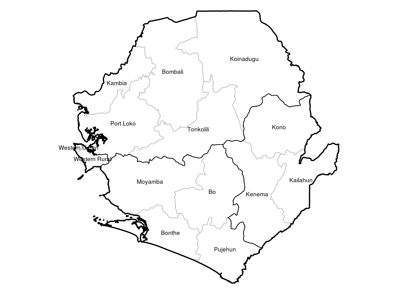
Spatial incidence data
Now we read in the surveillance data. Each case has an adm2 location attached to it
library(outbreaks)
dat <- ebola_sim$linelist

#randomly assign district location for now to simulated data
dat$adm2 <- sample(adm2data$NAME_2,size = nrow(dat),replace = T,prob = c(0.15,0.1,0.01,0.01,0.02,0,0,
                                                                   0.05,0.01,0,0.05,0.1,0.25,0.25)
                 )
To plot cumulative incidence we need to aggregate the cases by adm2 unit
agg_dist <- as.data.frame(table(dat$adm2))
names(agg_dist)[1] <- "NAME_2" # has to be the same column name is the adm2 in the shapefile
We then need to merge this with the shapefile
adm2data <- merge(adm2data,agg_dist,by = "NAME_2",all.x=T)
adm2data$Freq[which(is.na(adm2data$Freq))] <- 0
Then create a map of cumulative cases using spplot function from the ‘sp’ package
spplot(adm2data,"Freq")
Now tweak the colours. Here we use ‘RColorBrewer’ package. Firstly let’s see what palettes are available
library(RColorBrewer)
display.brewer.all()
and choose the red palette
col_pal <- brewer.pal(9,"Reds")[-(1:2)] # remove first two as white
my_col <- colorRampPalette(col_pal)
Now we put this into the maps
cats <- c(0,1,50,100,250,500,1000,1500,2000)
mp <- spplot(adm2data,"Freq",at=cats,col.regions=c("white",my_col(length(cats)-1)),col="#E0EEE0")
mp
Now we add other admin boundaries
library(latticeExtra)## Loading required package: latticemp <- mp + layer(sp.polygons(adm1data,lwd=1.2)) + layer(sp.polygons(adm0data,lwd=2))
mp
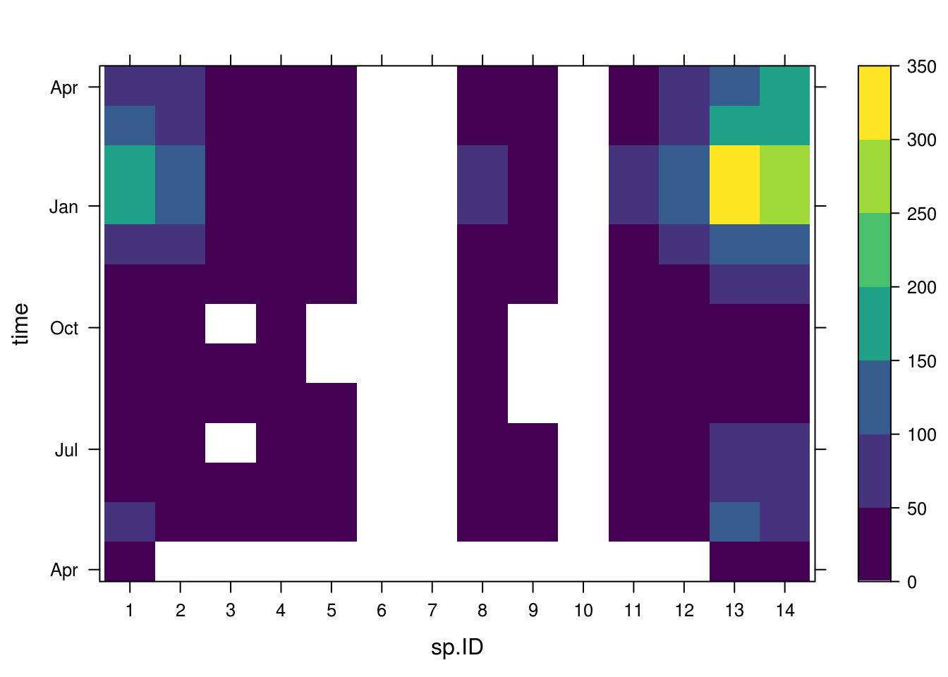
Plotting spatiotemporal data
Now we could like to see how the spatial incidence changes across the course of the epidemic
We use the incidence package to generate monthly incidence (every 30 days) by each district and the spacetime function from the epimaps package to then plot the data
library(incidence)
agg_dat_spatiotemp <- incidence(dat$date_of_onset,30,groups=dat$adm2)
#devtools::install_github("reconhub/epimaps")
library(epimaps)
mp <- spacetime(agg_dat_spatiotemp,adm2data,type="map",main="",pal = my_col,
par.strip.text=list(cex=0.7),col="#E0EEE0")
mp <- mp + layer(sp.polygons(adm1data,lwd=1.2)) + layer(sp.polygons(adm0data,lwd=2))
mp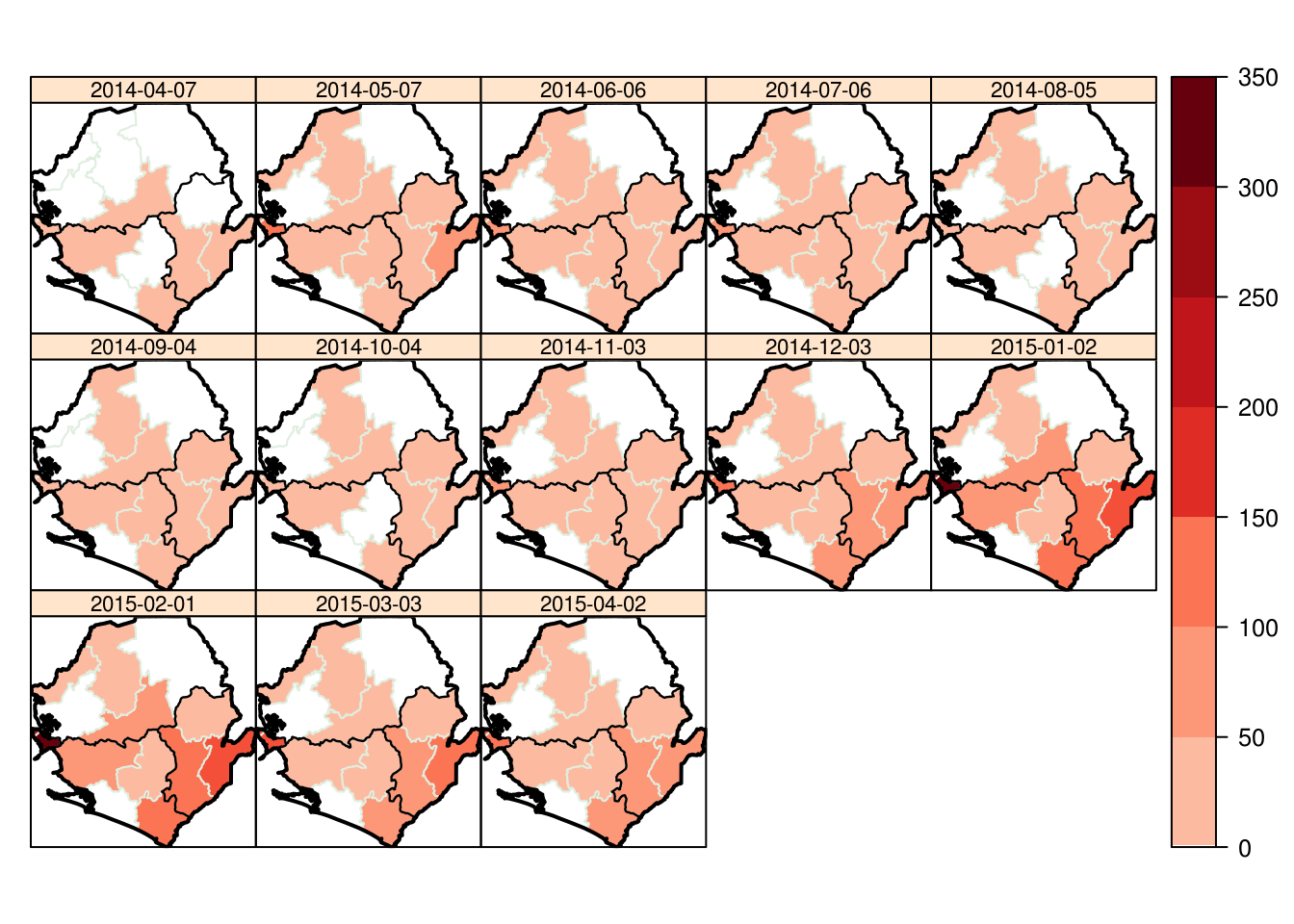
We can also view the data in a grid
spacetime(agg_dat_spatiotemp,adm2data,type = "heatmap",main="")