
Load packages
We will begin by loading the necessary packages for these analyses
library(sp)
library(sf)
library(osmdata)
library(tmap)
library(leaflet)
library(leaflet.extras)
library(lubridate)
library(ggplot2)
library(dplyr)
library(tibble)
library(purrr)
library(tidyr)Download and load the administrative boundary data
In order to get the administrative boundaries for use in our plots, we use the getData() function from the raster package, which connects to the Global Administrative Areas spatial database of administrative boundaries. These can also be downloaded directly via the GADM website.
In this case, we will download the admin level 2 file for Sierra Leone, which will initially be stored as a SpatialPolygonsDataFrame. However, we will convert this to a simple features collection for easier data manipulation and plotting (see the simple features website for more details).
sle_sf <-
raster::getData('GADM', country = 'SLE', level = 2) %>%
st_as_sf()Next, we simulate some case counts for each admin region, and store this as a variable “cases”.
# set.seed(1)
sle_sf <-
sle_sf %>%
mutate(
cases =
nrow(.) %>%
rnorm(mean = 100, sd = 70) %>%
round() %>%
abs()
)Generating static maps
ggplot2::ggplot()
Choropleth using continuous case data
ggplot() +
geom_sf(data = sle_sf, aes(fill = cases)) +
scale_fill_viridis_c() +
theme_minimal()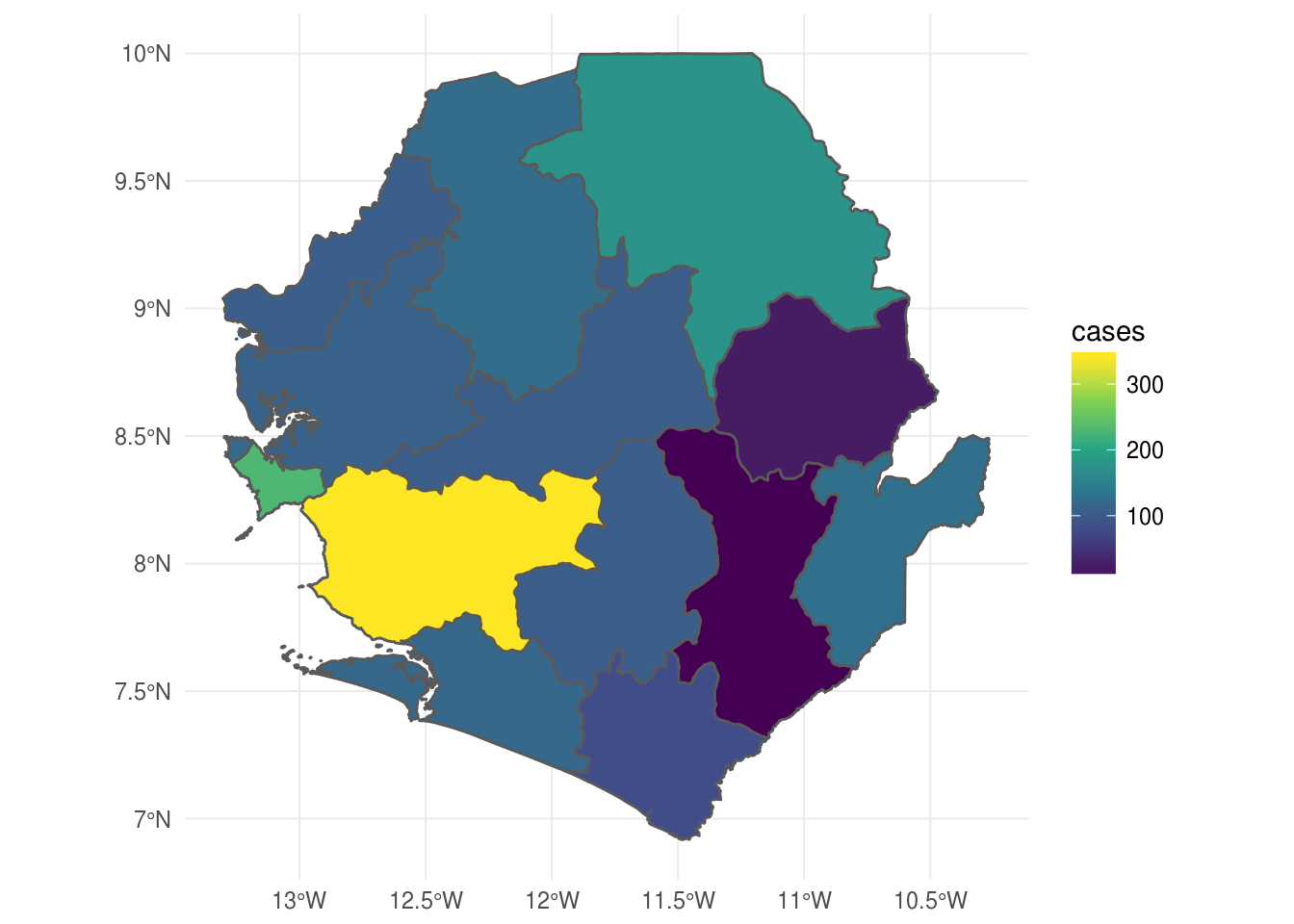
Point map using GPS coordinates of case-patients
First, we generate a simple features point pattern dataset using the ebola_sim$linelist simulated data found in the outbreaks package. We use the lon and lat variables for the coordinates.
ebola_sf <-
outbreaks::ebola_sim$linelist %>%
st_as_sf(coords = c("lon", "lat"), crs = 4326)
ggplot() +
geom_sf(data = sle_sf %>% filter(NAME_1 %in% c('Western'))) +
geom_sf(data = ebola_sf, size = .01, colour = 'red') +
theme_minimal()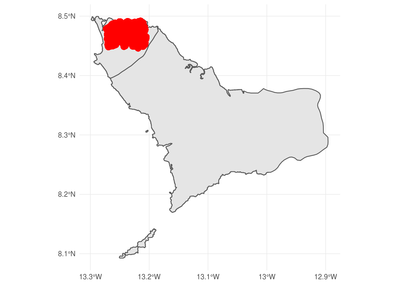
tmap::tmap()
At present, ggplot2 is a bit slow to draw sf maps, so we can try using the tmap package which has some great defaults and plots static maps quite quickly.
sle_tmap <-
tm_shape(sle_sf) +
tm_polygons("cases", palette = "Blues", title = "# cases") +
tm_shape(ebola_sf) +
tm_dots(color = 'red') +
tm_style_gray()
sle_tmap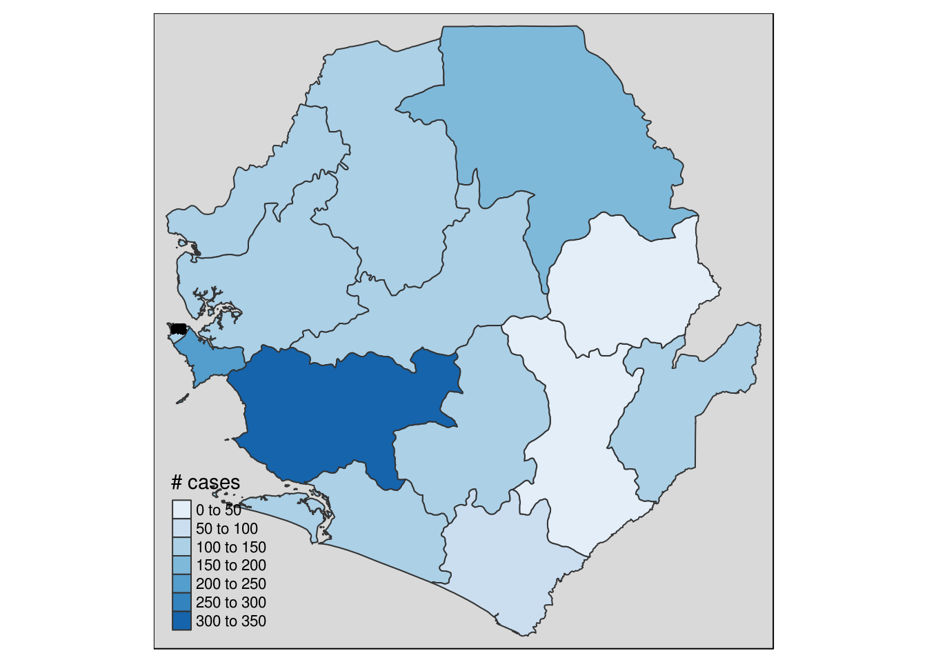
Generating dynamic maps
tmap::tmap_leaflet()
A very quick and dirty way to create an interactive map would be to pass the sle_tmap object we created above to the tmap::tmap_leaflet() function:
tmap_leaflet(sle_tmap)This has some lovely default behaviour, including a clear legend and the options to choose between 3 base maps and to show/hide the various datasets used (in this case, sle_sf and ebola_sf).
leaflet::leaflet()
However, by working with the awesome leaflet package, we can get much finer control over the output.
Plot cases
leaflet() %>%
addTiles() %>%
addCircleMarkers(
data = ebola_sf,
color = 'red'
)Plot cases with voronoi tesselation
vor <-
outbreaks::ebola_sim$linelist %>%
select(lon, lat) %>%
kmeans(centers = 60) %>%
magrittr::extract2('centers') %>%
as.tibble() %>%
do(deldir::deldir(.$lon, .$lat) %>% magrittr::extract2('dirsgs')) %>%
as.tibble()
vor_lines <-
map(
seq_along(1:nrow(vor)),
~
cbind(
c(vor$x1[.x], vor$x2[.x]),
c(vor$y1[.x], vor$y2[.x])
) %>%
Line() %>%
list() %>%
sp::Lines(ID = .x)
) %>%
sp::SpatialLines()
leaflet() %>%
addTiles() %>%
addCircleMarkers(
data = ebola_sf,
color = 'red', stroke = F, opacity = .8, weight = 2
) %>%
addPolylines(
data = vor_lines,
color = 'black'
)Plot cases as clustered points
leaflet() %>%
addTiles() %>%
addMarkers(
data = ebola_sf,
clusterOptions = markerClusterOptions()
)Plot cases as heatmap
leaflet() %>%
addTiles() %>%
addHeatmap(
data = ebola_sf,
minOpacity = 5,
blur = 20,
max = 0.05,
radius = 15
)Plot cases as heatmap with time-series
ebola_df <-
outbreaks::ebola_sim$linelist %>%
as.tibble %>%
mutate(
date =
paste(
month(date_of_onset, label = TRUE),
year(date_of_onset), sep = '-'
)
) %>%
nest(-date)
leaflet_base <- leaflet()
walk(
ebola_df$date,
function(x) {
leaflet_base <<-
leaflet_base %>%
addTiles() %>%
addHeatmap(
data = ebola_df %>% filter(date %in% x) %>% unnest(),
layerId = x, group = x,
lng = ~lon, lat = ~lat,
blur = 20, max = 0.05, radius = 15)
})
leaflet_base %>%
addLayersControl(
baseGroups = ebola_df$date,
options = layersControlOptions(collapsed = FALSE)
)Plot cases as choropleth
pal <- colorQuantile('viridis', sle_sf$cases, n = 5)
labels <-
paste0("<b>", sle_sf$NAME_2, "</b>:<br>", sle_sf$cases) %>%
map(~ htmltools::HTML(.))
leaflet() %>%
addProviderTiles('Esri.WorldTerrain', group = "Esri.WorldTerrain") %>%
addProviderTiles("Stamen.Toner", group = "Toner by Stamen") %>%
addPolygons(
data = sle_sf,
stroke = TRUE, weight = 1, color = "black", opacity = 1,
fillColor = ~pal(cases),
popupOptions = popupOptions(maxWidth = 500, maxHeight = 200),
fillOpacity = 0.5, smoothFactor = 0.5,
highlight = highlightOptions(
weight = 5,
color = "#666",
fillOpacity = 0.7,
bringToFront = TRUE
),
label = labels,
labelOptions = labelOptions(
style = list("font-weight" = "normal", padding = "3px 8px"),
textsize = "15px",
direction = "auto"
)
) %>%
addLayersControl(
baseGroups = c("Esri.WorldTerrain", "Toner by Stamen")
) %>%
addLegend(
position = 'bottomleft',
pal = pal, values = sle_sf$cases,
## below changes default legend from % to actual values
labFormat = function(type, cuts, p) {
n = length(cuts)
paste0(cuts[-n], " – ", cuts[-1])
},
title = 'Legend',
na.label = 'No data',
opacity = .5
)